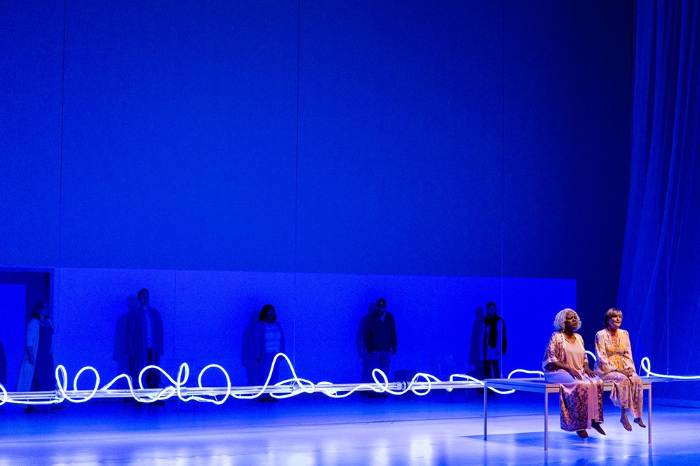

A stroke of simplicity brushed away a virtual inkwell of designs and the hundreds of hours of sketches that faculty, students and staff across NYU Abu Dhabi spent months working on.
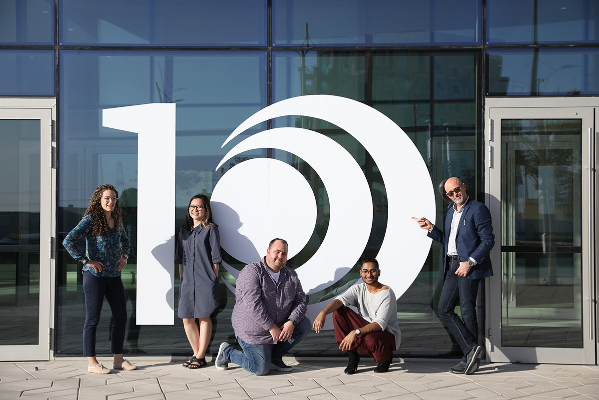
Instead of it being a sore point for Goffredo Puccetti, assistant professor of practice of visual arts, who was working with a design team on the task of coming up with the 10-year design logo for NYUAD, it was a moment of pride – the student surpassing the master. The moment he saw the design by one of his students, Van Anh Bui, he knew it was the one they should choose.
“We were all sketching ideas but the moment we saw Van's design, we all felt we we’re going to put our notes and sketches aside and continue working on that concept. The dynamism in it was as beautiful as it was powerful,” said Puccetti.
The task was simple: create a logo that demonstrates the nascency of NYU Abu Dhabi while illustrating the growth of the institution and projecting its future. How you deliver that in a logo requires constant work and some inspiration.

“We’re such a young institution, unlike many other universities that have hundreds of years of history. And at the same time we have accomplished a lot, but we are also still trying to surpass what we’ve done before. So the tone we would talk about our anniversary with, is something like: “We are very proud of what we’ve accomplished, but we are also looking forward to the future,” said Van Anh Bui, the student who had sketched the first version of the current 10-Year Anniversary logo.
Puccetti – working with instructor and alumni Erin Meekhof Collins, and the Public Affairs team tasked with creating the logo – was keen on having a bottom-up approach to the project, instead of hiring an advertising agency. He says having members of the community involved gives a more personal touch and delivers a product that is more intimately familiar with the importance of project.
Although the initial sketch delivered by Bui was met with unanimous consensus, Puccetti and the team of student designers and the Public Affairs team had much to work on. Owing to its minimalism, the logo required months of refinement, as Puccetti explained the more simple the design the more it requires minute adjustments to make sure it resonates as intended.

Simple stylistic nuances are woven into the very fabric of the design. Such as the 1, which wasn’t taken from a typeface but drawn from scratch. The flag at the top of the number was inspired by the University’s architecture, specifically the shadow cast by the lounges in the faculty buildings.
The final design was paired with the tagline “Here, we grow”. The statement, the designers felt, allowed for further elaboration of the intention of the logo. Its simplicity, homegrown design and local ownership is something the collaborative are proud of as the University moves into its next decade of growth.